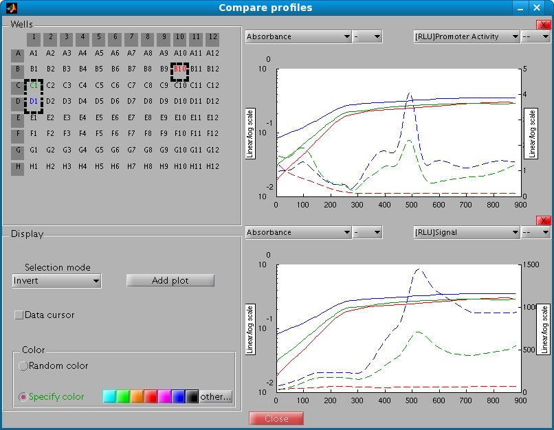
The profile comparison window allows you to compare the data and the profiles computed from the data in multiple wells. The window is organized in 3 parts:
Wells on the microplate can be selected by clicking on them. A click on a row or column header selects all rows or columns corresponding to the header.
Selected wells are highlighted and the color of their label corresponds to the color of the data in the plot.
There are three different selection modes available:
Checking Data cursor in the Tools section allows the user to display information on the curves by clicking the latter. A tool tip appears that displays the corresponding well number, the type of measurement or profile represented by the curve, and the values.
Pushing this button adds a new plot. The plot can be deleted by clicking its red upper-right corner X button.
The two radio buttons manage the way selected wells have their color assigned.
The first mode (random color) allows you to associate to each selected well a different color in a random way.
The second mode allows you to assign a specific color to the wells. To choose a color, you must click one of the colors in the small color palette. When the other... button is clicked, a color chooser appears from which any other color can be chosen.
A plot can be used to draw, for each selected well, at most two types of measurements or profiles computed from the data.
The upper left (right) combo box lists the data available for plot and the line styles.
The vertical axis can be either in linear or log scale. Change the scale by clicking on the button Linear/log scale.
Once you are satisfied with a plot, you can export it by right clicking. Available formats for export are : eps (encapsulated postscript), jpeg (bitmap) and matlab fig format (which can be loaded into MATLAB).